• Modern CSS lets you build responsive hexagon grids without JavaScript or media queries. • The new corner‑shape property replaces clip‑path, simplifying hexagon creation with aspect‑ratio and border‑radius. • Sibling‑index() and unit‑division features cut down on magic numbers and hard‑coded calculations. • CSS variables control size and gap, making the grid easily adjustable for any item count. • The technique currently supports only Chrome, leveraging recently released CSS features. • Compared to the 2021 method, the new code is shorter, cleaner, and easier to maintain. • The article walks through complex calculations, showing how CSS has evolved over five years.
Article Summaries:
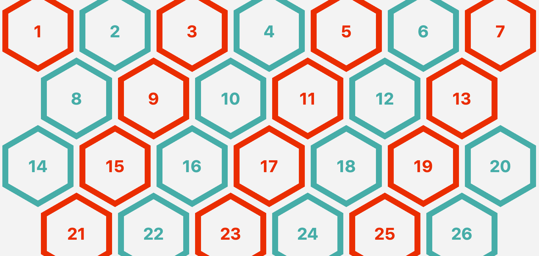
- The article revisits a 2021 technique for building responsive hexagon grids without media queries or JavaScript. It explains how recent CSS features-such as
corner‑shape,sibling‑index(), and unit division-simplify the construction of hexagonal shapes and grids. By replacing olderclip-pathtricks withcorner‑shapeandaspect‑ratio, the new implementation reduces magic numbers and hard‑coded calculations. The grid itself is built with flexbox, using CSS variables for size and gap, and dynamic margins to create the staggered layout. The approach remains Chrome‑only due to the experimental nature of the new properties, but demonstrates how modern CSS can make complex layouts cleaner and more maintainable.
Sources: