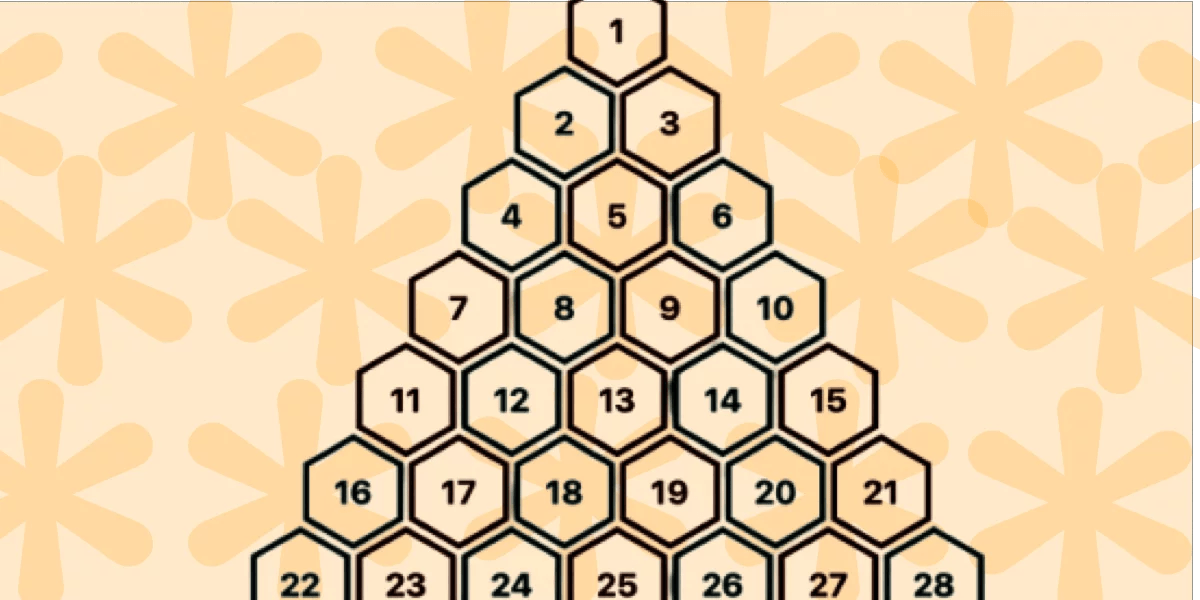
• In the previous article, we built the classic hexagon grid. • It was a responsive implementation without the use of media queries. • The challenge was to improve a five-year old approach using modern CSS. • Support is limited to Chrome only because this technique uses recently released features, including corner-shape , sibling-index() , and unit division. • In this article, we will explore another type of grid: a pyramidal one. • We are still working with hexagon shapes, but a different organization of the elements.
Article Summaries:
- Summary
The article introduces a new responsive pyramidal grid built with modern CSS, extending a prior hexagon‑grid tutorial. Using CSS Grid instead of Flexbox, the layout automatically adjusts to available space without media queries or JavaScript, relying on recent features such as corner‑shape, sibling‑index(), and unit division. Hexagonal elements span two columns, and a calculated negative bottom margin ensures proper stacking. The design guarantees an even number of columns, shifting every other row by one column to create the pyramid shape. While currently Chrome‑only, the technique offers a clean, scalable alternative to older five‑year‑old approaches.
Sources: