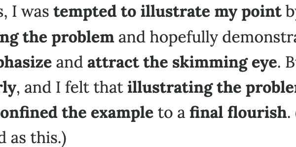
• Excessive Bold 28 January 2026 Martin Fowler bad things writing I’m increasingly seeing a lot of technical and business writing make heavy use of bold font weights, in an attempt to emphasize what the writers think is important. • LLMs seem to have picked up and spread this practice widely. • But most of this is self-defeating, the more a writer uses typographical emphasis, the less power it has, quickly reaching the point where it loses all its benefits. • There are various typographical tools that are used to emphasize words and phrases, such as: bold, italic, capitals, and underlines. • I find that bold is the one that’s getting most of the over-use. • Using a lot of capitals is rightly reviled as shouting, and when we see it used widely, it raises our doubts on the quality of the underlying thinking.
Article Summaries:
- The article critiques the growing trend of overusing bold text in technical and business writing, a practice amplified by large language models. The author argues that excessive typographical emphasis dilutes its impact, noting that bold, while eye‑catching, becomes ineffective when used too often. They contrast bold with other emphasis tools-italics, capitals, underlines-highlighting italics as a subtler, more effective option for important phrases. The piece recommends sparing use of bold, especially within prose, reserving it for headings, unfamiliar terms at first mention, or key sentences, and suggests callouts as a superior alternative for drawing attention.
- The article warns against the overuse of bold text in technical and business writing, noting that excessive typographical emphasis weakens its impact. It explains that while bold can quickly draw a reader’s eye-useful for headings and key points-its effectiveness diminishes when applied too often. The author contrasts bold with other emphasis tools, favoring italics for subtlety and callouts for clearer, more engaging highlights. Practical advice includes sparingly bolding unfamiliar terms at their first explanation and reserving bold for important sentences or headings. The piece ultimately encourages writers to use typographic emphasis judiciously to maintain clarity and reader engagement.
Sources:
- https://martinfowler.com/bliki/ExcessiveBold.html (Latest source article published: 2026-02-25 06:43 UTC)